Matt vs Satin vs Gloss: Choosing Your Paper Finish
13 August 2026
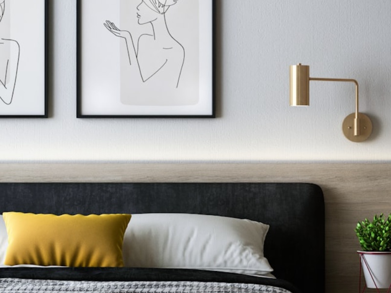
Matt: the safe, versatile choice
Matt paper has a smooth, non-reflective finish - true colours with no glare, whichever way the light in the room falls. It's the most popular choice for photography and artwork alike, and the safest all-round pick if you're not sure which paper to go for.
Satin: a middle ground
Satin sits between matt and gloss - a subtle sheen that adds a touch of depth to colours without the strong reflections gloss can produce. It works particularly well for portraits and images with a lot of fine detail.
Gloss: bold and vivid
Gloss paper produces the most vivid, saturated colours and the deepest blacks, at the cost of a reflective surface that can pick up glare under direct light. It suits bold, high-contrast images - think travel photography or vibrant graphic art - best in a spot that isn't directly opposite a window or bright lamp.
Our recommendation
If in doubt, start with Matt. You can always order a second poster in a different finish once you've seen how the first one looks on your wall.